Black and white is a kitchen decorating trend that will never go out of style. From the 1950s onward, these two colors have been elevating kitchens of all sizes and styles, and they never seem to lose traction.
We found five kitchens that are proof positive of the staying power of black and white — and we just can’t get enough.
Sleek and Modern with an Inviting Flair
One of the biggest misconceptions about black and white kitchens is that they are stiff, cold, or boring. When these two colors are used the right way, they create warmth, excitement, and an inviting aesthetic that few other colors can.
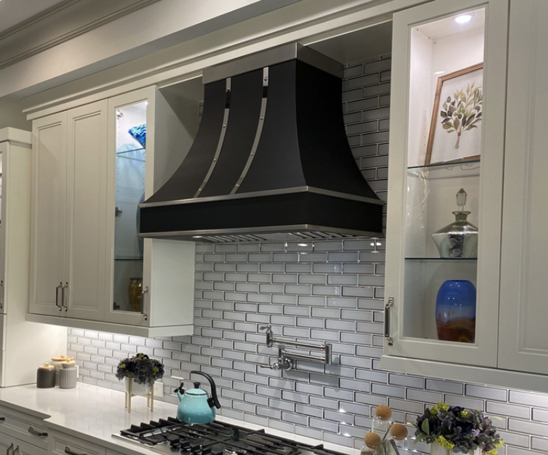
Take this kitchen, for example. It should first be said that every single addition and accessory here has been intentionally added and carefully considered, and it all works perfectly.
The small accessories in the lighted cabinets and on the countertop add aesthetic interest; they stand out, but not so much that they “confuse” the overall look of the space.
The centerpiece of this kitchen is the fantastic custom range hood, which coordinates not just with the burner grates on the cooktop but also with the double oven on the far side of the room. While the body is matte black, the straps and rivets have a stainless steel finish.
This stainless finish is the same as the handles on the cabinets, drawers, and cupboards, providing a seamless flow from one end of the room to the other. Notice the gorgeous pot-filler faucet above the cooktop; it also has the same stainless steel finish.
One of the biggest kitchen design trends in 2022 is using unexpected contrasts, and this kitchen pulls it off nicely. The cabinets and drawers are traditional in design, but the double oven, cooktop, and range hood have a more modern appearance.
Using surprising contrasts like this adds visual interest without overdoing it with a bunch of colors or accessories.
The tile wall behind the range is neither black nor white but instead is more of a gray. This keeps the space from being overly bright or excessively dark. Finally, the recessed lights in the ceiling, as well as the recessed cabinet lights and the under-cabinet lights, are functional without taking up any visual real estate in the room.
Black, White, and Brass in the Kitchen
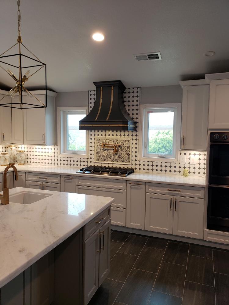
The first thing you might notice in this kitchen is the diamond-patterned black and white tile wall, along with the black custom range hood above it. Both of these elements are retro or traditional in design and create a feeling of nostalgia in the room. This kitchen doesn’t appear to have too much natural lighting, so the decision to have white cabinets and drawers was a good one. The counter and island counter are also both white, all of which help to brighten the room and prevent it from being too dark.
On this note, it might seem at first to make sense that the range hood should also be white; however, a white hood in this kitchen would result in the lack of a true focal point, which would make the room seem bland and dull. As it is, it’s just enough black to draw attention to this beautiful focal point. Offsetting the black to brighten the hood up a bit are brass straps and brass rivets, and this is the same finish as all of the hardware on the cupboards, drawers, and cabinets. The island faucet is brass, and so is the pot-filler faucet above the cooktop.
Having all of these brass accessories match each other not only maintains visual continuity throughout the space but also adds interest. Mirroring the brass on the range hood is the brass chandelier above the island. The dark flooring in this kitchen was also a great choice because it adds depth to the room and prevents it from appearing too washed out in white. Speaking of adding depth and preventing wash-out, the floral semi-backsplash behind the cooktop and pot-filler faucet offers a completely contrasting pattern to the geometric one of the wall behind it. While the colors of the backsplash don’t vary much from the geometric wall, the pattern certainly does. Remember: The hot kitchen trend right now is unexpected contrasts!
A Modern Farmhouse Kitchen
The farmhouse design trend is something that means many different things to many different people. Often overlapping and confused with terms like “shabby chic” and “vintage,” the farmhouse trend actually has its own unique features and highlights, all of which are perfectly displayed in this kitchen.
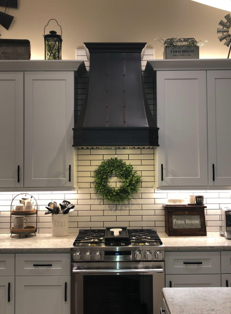
One of the first things you will notice here is the green foliage wreath hanging above the range. Upon further inspection, you’ll see this adds to the little bit of flora at the very top of the room over the cupboards. While such details aren’t often added to modern kitchens, it’s the perfect addition here to enhance the whole farmhouse feel of the space.
The white cabinetry, light-colored countertops, and white subway tile wall are excellent choices for this kitchen, too. Since they are neutral shades of white, they don’t take any attention away from the real centerpieces of this set-up, which are the beautiful gas range and the custom range hood above it.
A great example of unexpected contrasts is seen in this kitchen with the stainless steel range, which people usually would not consider for a farmhouse kitchen. However, the fact that it is a smaller range solidifies its position as the perfect choice, as it adds a modern touch to the room’s overall design without destroying the farmhouse feel.
The range hood also contrasts with the range; it’s a much more traditional-artisan piece that pulls together the farmhouse design nicely. Its dark finish ensures that it goes well with the range, creating a perfect pair despite the different metals and finishes.
With all of the white surfaces, light-colored stone, and stainless steel, it becomes important in a room like this to add touches that make the space inviting and relaxing. All of the tasteful accessories in the room do a fine job at this, and to showcase these accessories, soft recessed under-cabinet lighting is used to warm up the ambiance.
Dramatic Copper at Its Best
Some of the best kitchens in the world are the ones that are designed just as deliciously as the food that is prepared in them. This kitchen is no exception. “Dramatic Copper” is the name of the game here, where traditional meets luxury meets convenience, all in one space.
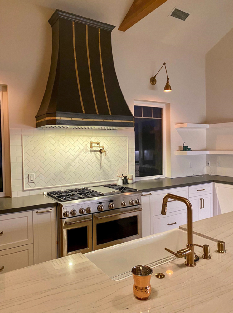
The immediate centerpiece of the room is without a doubt the more-than-grand classic range hood, with a smooth black finish, copper straps, and copper rivets. The five sides of the hood, along with the apron, give it a traditional, classic look that is every bit as impressive as it needs to be for the large kitchen that houses it.
Copper is the highlight metal of the kitchen, and it’s used all over. The faucet and pumps on the island; the knobs, handles, and bezel on the range; the pot-filler faucet; the wall light above the window; and the handles of the cupboards and drawers are all brass. Even the drinking cup near the sink is copper.
The secondary metal in this kitchen is seen in the large luxury range, which sports a stainless steel finish. This is a good time to put out a reminder that a popular kitchen design trend this year is to mix metals, such as in the combination of copper and stainless steel we see in this kitchen.
It’s important to note that there is a lot of white in various shades throughout this space, and although copper is an ideal finish for the hardware and accessories, the color that really makes a difference here is black. The black in the range, the black range hood, and the black countertops are essential because they prevent the room from appearing completely washed out in white. Sometimes, the best way to pull a room together is to not continue a color scheme from top to bottom or from left to right. Instead, interrupt it with just the right amount of contrast. Well done, black and white.
Classic with Some Nostalgia on the Side
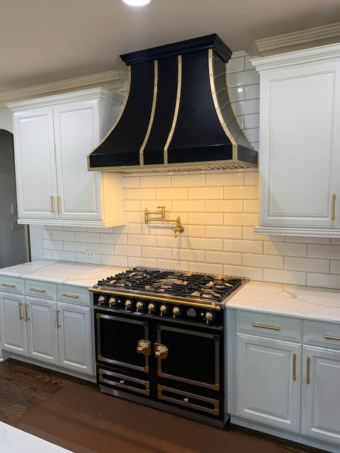
If you’ve ever wondered if a range and custom range hood can make or break the entire visual aesthetic of a kitchen, here’s your answer! With such a grand pair, everything in this kitchen that’s white seems to disappear — almost.
The white subway tile wall, cabinets, drawers, and cupboards are quite essential to the overall design of this incredible nostalgic room. The contrast between black and white in this spectacular kitchen may be obvious, but what isn’t so obvious is the impact that a few small details make.
These details are the brass fixtures and hardware throughout the space. Not only are the drawer pulls and cabinet handles brass, but the range handles, knobs, and bezel are also brass. In addition, the pot-filler faucet is brass, and so are the straps and rivets of the range hood.
All of the brass hardware and details do a beautiful job of providing fluidity in an otherwise very contrasting space. Using white marble counters was a great choice, too; black marble would’ve been much too dark and would interrupt the flow of that side of the room too much.
It’s all about balance. The same goes for the choice to use a black range and range hood; a white pair of appliances would have been too much and made the space lackluster and largely uninteresting.
It’s apparent in this kitchen that details make the difference, and one detail that should not be overlooked is the hue of the lights used in the range hood.
The soft yellow light was an intentional choice to highlight the brass in the room. It also softens the entire visual aesthetic of the space. White light would’ve been much too harsh and wouldn’t have brought all of the brass elements together nearly so nicely.
The white recessed lighting from the ceiling is a different story, however. Consider the fact that the kitchen is mostly white with brass as the accent color. What is really fantastic is that the lighting used here also follows suit: The main ceiling lights emit white light and the accent lights give off a “brass” light. Pretty impressive, right?
When all is said and done, you can never go wrong with a black and white kitchen. These days, it’s very trendy to dress the kitchen in little accent metals like brass and copper. Remember that range hoods are extremely important in any kitchen, and don’t hesitate to experiment with the beauty of unexpected contrasts!


