6 White Kitchens that You Must See!
White kitchens have replaced the black ones of 2021 as the trending design for 2022. Bright, airy, and clean, these kitchens are anything but ordinary! We’ve found six white kitchens that are nothing short of stunning to share with you here. If you’re looking for inspiration for white kitchen design ideas, read on.
An Open Concept with Pops of Bold Color
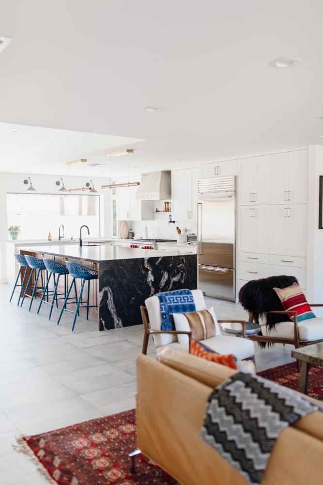
Nothing says “modern” like sharp, clean lines, bright white from floor to ceiling, and crisp accessories to round out the contemporary look. From the refrigerator to the brass drawer pulls to the lights above the island, everything in this kitchen just seems to shine.
Some unexpected contrast is introduced here, which makes the entire space more interesting. Although the white color and state-of-the-art appliances are contemporary in appearance, the small table to the left, its chairs, and the kitchen island chairs all have a vintage vibe to them.
The blend of modern and retro works well here, especially because the white leaves room for plenty of color pops, which all of the chairs here provide.
Another kitchen design trend that is popular these days is mixing metals. Although in years past it was trendy to make sure everything matched as far as finishes were concerned, today it’s quite the opposite.
It’s a good thing, too, because the stainless steel range, range hood, and refrigerator are beautifully accented by the brass handles of the surrounding cabinetry. You can also see brass on the stunning custom range hood and the light fixtures. These accents tie the room together quite nicely.
There are a couple of additional punches of color in this kitchen. The striking red knobs on the range, the black sidewall of the island, and even the little plant on the counter are all unexpected details that draw the eye.
All of these elements are intentionally included to add visual interest to the space and an inviting feeling to an otherwise stark room. Choosing white as the ceiling color as well as the floor keeps the scheme consistent throughout the area, giving it an elevated, airy feel.
Old World Meets the New
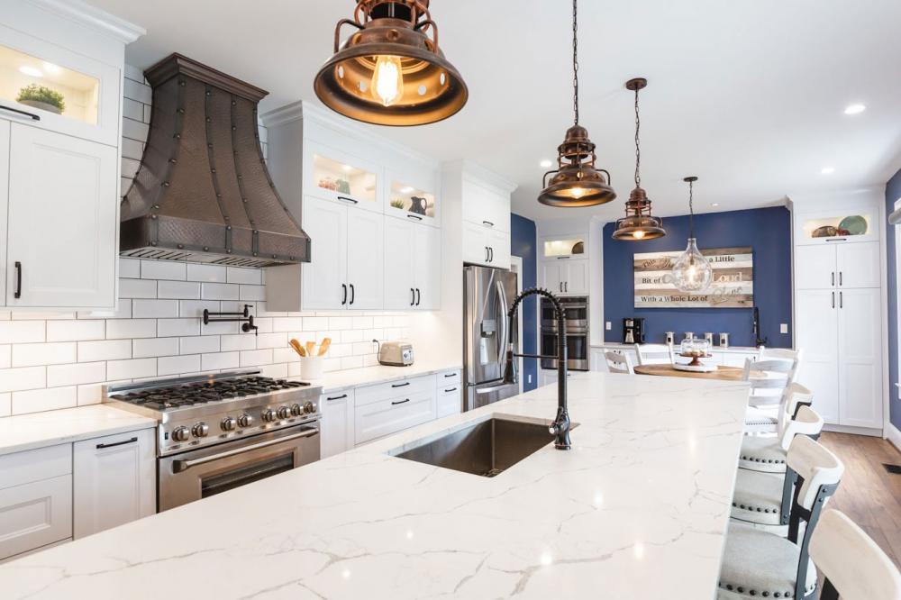
It’s a wonder anyone ever leaves this beautiful white kitchen, where so many details have been thoughtfully placed. Right away, we notice the incredible custom range hood in copper, which has an old-world styling to it. This classic design was meant to serve as the centerpiece of the room, and it does not disappoint.
The fantastic pendant lights above the large island in this kitchen were chosen to complement the range hood, and they do a marvelous job of it. Their stunning finish and antique design are the perfect matches for the luxe hood.
These lights are simple enough that they don’t make the space appear too busy or fussy, yet intricate enough that they add a great amount of visual interest. The finish of the island faucet and sink are also a darker finish, further tying the room together.
You’ll notice above the stove a sensational pot-filler faucet, which also has a matching finish. This makes a gorgeous statement against the white tile wall on which it’s placed.
The island countertop, the main counters, the wall behind the range and hood, and the cabinetry are all white, which is the perfect choice to evoke a clean, modern aesthetic in the room. The choice also doesn’t detract attention from the pendant lights, the beautiful range, or the custom range hood.
The blue walls on the far end of this kitchen are the ideal color to complement the dark features that are so perfectly placed. Since the room is large, the color does a great job of making the space feel more inviting without making it seem too small or over-stuffed.
Finally, the lighting in the upper cabinets is a classy touch that draws the eye up to the contents on the shelves within. The remaining ceiling lights are recessed in order to add plenty of light without having a dozen distractions hanging from the ceiling. Instead, they keep the attention where it ought to be.
Small and Stunningly Simple
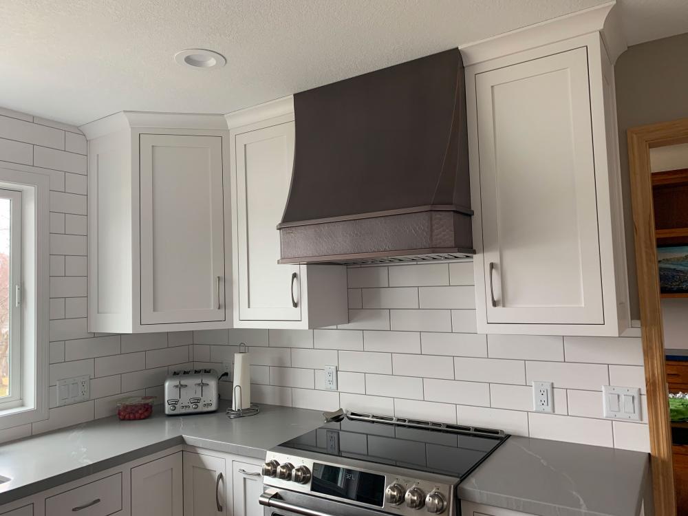
This beautiful white kitchen makes the most of a small space in the best way. By blending some retro design elements with contemporary modern ones, this kitchen exhibits a spectacular design while remaining versatile and simple.
The modern range is a hefty one that is uncompromising; just because a kitchen is small doesn’t always mean it must have a small range. The custom range hood that stands above it is also a perfect size, and the dark copper textured finish lends a bit of vintage style to this kitchen design.
Although the range is stainless and black and the hood is neither of those, it still works well here. This is because the color of the hood coordinates with the darker brown hue of the flooring, so it does a nice job of pulling the room together vertically.
The white cabinetry and white tile wall in the kitchen are excellent choices that keep the room feeling as large as possible without feeling boring. The tile on the wall adds aesthetic interest, and the gray countertops break up the white to a perfect degree.
The handles on the cupboards, cabinets, and drawers complement the finish of the range, creating a nice flow from one end of the room to the other.
The lighting in this kitchen is underplayed and isn’t meant to be a focal point or even a detail to be noticed, which is an excellent choice. With small rooms, it can be easy to add too many details and unintentionally make the space appear stuffy or crowded. One of the best ways to avoid that is to use recessed lighting.
Recessed lighting isn’t just used on the ceiling. If you look carefully, you’ll notice small lights on the underside of the range hood that don’t protrude at all. These lighting choices ensure the room has plenty of light without taking up any visual real estate.
Linear Luxury in White
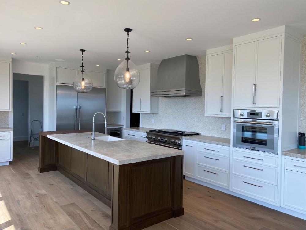
This extraordinary kitchen does an excellent job of tying together details and appliances with different colors and finishes. Instead of relying on bold colors on walls to do the work, this kitchen is designed to make sure the attention remains where it should — on the center island and the custom range hood.
The tone of the flooring sets the stage of this kitchen with a bit of a classic, old-world feel, which is followed through nicely by the brown wooden island panels. Two dark pendant lights hanging above the island add an air of simple beauty.
The large range and custom range hood have a stainless steel finish, which is also carried through the room by the wall oven and the refrigerator. For many years, stainless steel has been considered to be a premium finish that brings strength and luxury to kitchens. In this case, that follows.
This beautiful stainless finish continues from one end of the kitchen to the other in a linear fashion with the extra-long drawer pulls and cupboard handles. It also can be seen on the island faucet, extending the reach of the stately stainless finish.
The countertops and the wall are not plain white; instead, they both have a blend of neutral hues in them, including grays and light browns. If you’ll notice, these are the three main colors that are found in the appliances, flooring, and cabinetry.
Once again, we see the great choice of recessed lighting used in this white kitchen. Some natural light comes into the kitchen from a window that is out of frame, but when evening falls, the two large pendant lights won’t be enough. Recessed lighting saves the day by giving much-needed light without getting in the way.
Dramatic Design with White Clarity
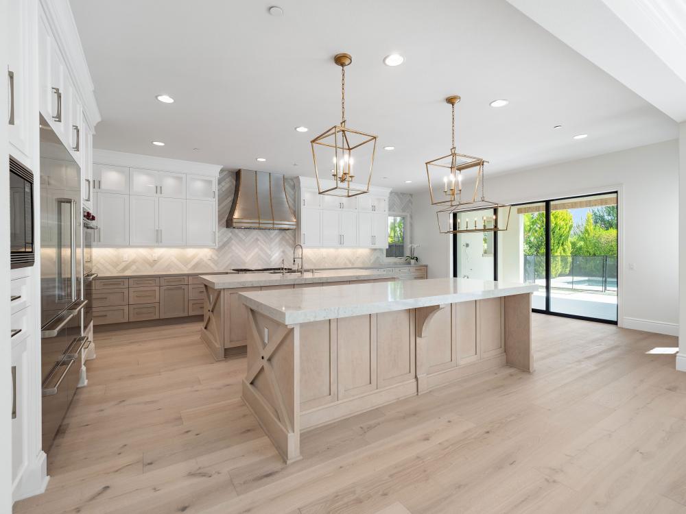
If you’ve ever thought that a white kitchen couldn’t ever be warm and inviting, take a look at this one! Even though it’s bathed in white from one side to the other, its superior design and details create a welcoming room that just makes you want to walk right in.
While many white rooms have dark hardwood floors to provide visual contrast, this kitchen has much lighter-colored wood both for the flooring as well as the islands. It’s the finish of choice for the cabinets along the back wall, as well.
This was intentionally done in order to make way for the visual contrast provided by the gorgeous custom range hood, the range, and the refrigerator. All three of these appliances have a stunning stainless steel finish, which is strikingly beautiful when surrounded by white cabinetry and light-colored wooden flooring.
We can also see good use of the popular kitchen trend to mix metals. Although the large appliances have a stainless finish, shiny brass is also used. Brass is in the frames around the pendant lights as well as in the rivets and straps of the custom range hood. Using brass in these elements creates continuity throughout the entire space.
Recessed lighting once again is present, and it fills the entire room. There are also recessed lights under the upper cabinets of this kitchen. Even though there are several different types of lighting used all in one space, it’s all perfectly done because each type of lighting has a specific purpose.
Interestingly enough, the key to creating dramatic flair in this kitchen is simplicity. The pendant light frames are minimalist, the neutral colors, tones, and finishes are simple, and the layout is airy, open, and spacious. It’s this spaciousness that solidifies the overall dramatic aesthetic that makes this kitchen spectacular.
Dark Industrial Meets Luxurious White
The industrial decor trend is one that has been around for a few years now, but a newer kitchen design trend involves scaling back some of the industrial stuff and making room for streamlined, contemporary details to go with it.
The main focal point of this kitchen is the amazing custom range hood, which is industrial in design with its striking lines and deep black finish. The trim around the window, the wall countertops, and the island pedestal are also a deep color as well.
This kitchen is also a great example of the power that little details can have. The light above the sink, the faucet, and the star accessory also have a dark finish that contrasts perfectly with the white.
The dark finish continues with the trim of the skylight on the ceiling, the hardware on the cabinets and drawers, and the excellent pot-filler faucet above the range. All of these small, dark-colored details against the white backdrop of the other kitchen components create a striking contrast that adds visual appeal on a perfect level.
Speaking of finishes, let’s take a look at the range and the dishwasher. In years gone by, a designer might have gone with a black finish for these appliances in order to stay in line with the other dark additions in the room, especially the hood.
However, these days, it’s all about unexpected contrast in design, so this kitchen takes that trend by the horns with stainless steel appliances. The stainless steel helps to push the industrialist feel of the dark range hood further while making a statement of its own at the same time.
Finally, let’s talk about texture in this kitchen — specifically, the flooring and the wall that surrounds the counters. Both feature the same neutral hues and pull the room together quite nicely.
But look closely and you’ll also notice something else: the floor resembles a larger “mirror” of the tile wall. Each floorboard is much shorter than the typical floorboard, making them all resemble a larger-scale version of the bricks of the wall. Amazing, right?
As you can see, the mundane white kitchens of bygone trends have made way for white kitchens that are inviting, spacious, and visually spectacular, thanks to custom range hoods and carefully selected details. Today’s kitchen trends focus on breaking the design rules of decades past, so don’t be afraid to experiment!
