A kitchen design that includes a unique style and personal aesthetic is how designers and homeowners are choosing to design their kitchens. And this incorporates not only functional appliances but also creatively designed appliances. This allows the designer and homeowner to personalize their kitchen and all of its elements in a way that appeals to their unique style and also shows off their aesthetic. No longer are kitchens simply for functionality, but they are also for appeal and style. Designing a modern kitchen with this unique aesthetic has increased in demand.
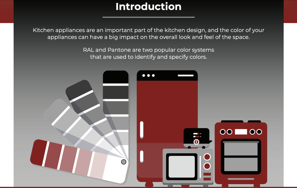
Manufacturers have started to offer a wide variety of colors for stoves, cooktops, and range hoods. Of these choices are the RAL and Pantone, which are two popular color systems used in appliance manufacturing. Homeowners are able to create a visually appealing kitchen design and, in many cases, a kitchen that creates an ambiance that sets a mood for hanging out with friends and family, cooking together, or basking in the quietness of a morning coffee.
This comprehensive guide will explore the most popular RAL and Pantone Appliance colors and provide helpful tips for choosing the right color to fit your aesthetic and design style.
 Why should you Color Match your Kitchen Appliances?
There are many reasons why you may want to consider color-matching the appliances and other features within your kitchen. Firstly, as discussed above, it can help each and every design decision within your kitchen appear more considered and purposeful, creating a space that feels cohesive and well put together.
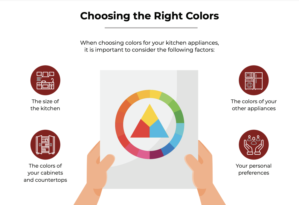 Furthermore, this can also be a great way to introduce new colors into the space - whether you are opting for something bright and bold or a little more muted and traditional.
Either way, before you kick start the process of color matching your exhaust stove hood, you may want to look into color psychology - which is a scientific theory that explores the way in which exposure to different colors can impact our mood. When utilized to your advantage, you can use this theory to alter the atmosphere within your kitchen.
Understanding the RAL and Pantone Color Systems
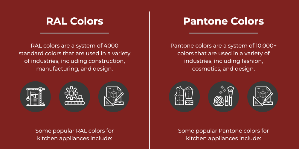
When choosing the perfect color for your appliance, it will be a different experience than choosing a wall color to update a bathroom. First, you must understand and know the basics of the RAL and Pantone color systems.
1. RAL Color System
First developed in Germany in 1927, the RAL color system is a widely used color standard used in automotive, construction, and appliance manufacturing. RAL colors are organized into several collections, such as RAL Classic, RAL Design, and RAL Effect. Each color has a unique four-digit code, making it easy to identify and match colors accurately.
2. Pantone Color System
Pantone is a color system created in America in the early 60s, where it was
widely used in graphic design, fashion, and product manufacturing. The Pantone Matching System (PMS) uses thousands of standardized colors, each with a unique alphanumeric code similar to the RAL system. Pantone colors are known for their consistent and accurate reproduction across different materials and manufacturing processes.
Popular Colors
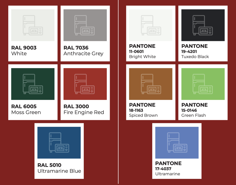
The popularity of RL and Pantone colors is far-reaching among designers and manufacturers. So much so that there are a set of most used colors for stoves, cooktops, and range hoods. These commonly used colors have become the ones most frequently chosen by designers and manufacturers. When you're deciding the colors for your kitchen appliances, it's best to consider choosing appliances with matching RAL or Pantone colors.
RAL Colors
The most popular and frequently used colors across the color system for the RAL color systems are signal white, pure white, traffic white, Anthracite Grey, dusty grey, ruby red, light grey, ultramarine blue, and Moss green. Each color in the RAL color system has its own specific code as well as a description of the color.
For example, the choices of the color white are described as either crisp and clean to best fit a modern kitchen design, warm to fit a traditional and farmhouse style kitchen, and cool and neutral to fit a contemporary and minimalist kitchen design. The color grey in the RAL color system appeals to a certain aesthetic and style that is more sophisticated and elegant with the cool, calming, versatile,
and timeless colors of grey. The last three most popular colors in the RAL color system are the brighter colors of red, Ultramarine blue, and Moss green. These colors work best with appliances in a kitchen owner chooses to be eye-catching, visually appealing, vibrant, and even intense.
Pantone Colors
Now let's talk about the popular colors in the Pantone color system. That color system has a bright white, cloud dancer, cool Gray one, cool Gray 9, warm Gray three, red, blue, lime green, and yellow. Similar to the RL color system, these popular Pantone colors also have their own Pantone code unique to that specific color. They also have specific descriptions to help homeowners determine exactly what type of color they're looking for to match their kitchen style.
The bright white is described as bright, light, and airy. This work best in a traditional and farmhouse-style kitchen as a soft and subtle white color. Cool Gray 1 works as a neutral color for a contemporary and minimalist kitchen design, while Cool Gray 9 works best in a kitchen that is sophisticated and elegant. Warm Gray 3 works in a kitchen whose aesthetic is cozy and welcoming, inviting its guests in.
Then you have the brighter colors like red for a bold and vibrant kitchen, or blue for a classic and versatile kitchen needing just a splash of color; lime green adds energy and vitality to a kitchen; and yellow does best for a kitchen that aims to be bright and cheerful. When it comes to color names and custom color options, some manufacturers may have proprietary color names or offer additional custom color options beyond RAL or Pantone.
Tips for Matching RAL and Pantone Colors Across Kitchen Appliances.
1. Consult the Manufacturer's Guidelines
To ensure that you have the right R AL or Pantone color match, it's best to consult the manufacturer's website or call customer service for specific color options and availability. Some manufacturers may choose to only use proprietary color systems or offer a specific number of standard colors. You don't want to make a purchase on your appliance before you have chosen and verified your desired color.
Taking the time to familiarize yourself with the manufacturer's guidelines can help you to bring your vision for your kitchen to life, creating a space that feels both cohesive and stylish - and avoid design faux-pas such as installing features with clashing colors that detract from the overall aesthetic value of your home or kitchen.
2. Order Color Samples
Certain RAL and Pantone colors that are displayed on their website may not look the same in person. A screen display versus a face-to-face color match always has variations. But there is a way to remedy that. It is always recommended that you order color samples from manufacturers or retailers before you make a final decision on your appliance color. With the color sample, you're able to match the color in person under your kitchen lighting to guarantee that it is a perfect match for your kitchen design and style.
Furthermore, trying out different color samples will help you to determine whether or not you genuinely LOVE a color, which is essential when you consider the fact that it's something you’ll be seeing every single day. This can be instrumental when it comes to avoiding selecting a certain color or shade because it is en-vogue or trending, only to realize that you do not like it at all further down the line.
3. Use a Color-Matching Tool
There are color-matching tools that help homeowners and designers pinpoint the exact color for their kitchen appliances or kitchen accessories. These color-matching tools are known as the NCS Colorpin or Pantone Color MatchCard. They work by measuring the color of a surface to generate the closest RAL or Pantone match, allowing for a smooth process in coordinating your new-colored appliances with your existing kitchen design.
Again, this can be useful in ensuring that you do not accidentally select the wrong color when ordering new appliances - especially as they may not look all that different to the naked eye without using these tools as a reference point. Additionally, this can be useful when selecting complementary shades to pair with each appliance, too, as you can select colors that sit close together on the colorpin.
4. Work with a Kitchen Designer
Homeowners all have their own idea or vision for the design style they want in their kitchen. And this is great, But sometimes having the unbiased eye of an interior designer provides great help in deciding that not only is esthetically pleasing but also works well all around.
As such, it's well worth the extra cost of hiring a kitchen designer, given that they can be instrumental in bringing your vision to life - helping you turn a space that currently exists only in your head into a reality. As discussed above, it can also help you avoid common design mistakes beyond color-matching errors.
A professional kitchen designer can help to decide on the best RAL or Pantone colors for your appliances and provide seasoned advice on the best colors for your specific kitchen design style and needs, what color is best suited for your appliance, and peace of mind in your selections.
5. Consider Complementary Colors
In some cases, it may not be possible to find appliances with perfectly matching RAL or Pantone colors. Consider choosing complementary colors that create a harmonious and visually appealing color scheme even if they are not exact. For example, you might pair a bold red stove with a more muted gray range hood or a vibrant blue cooktop with a black range hood.
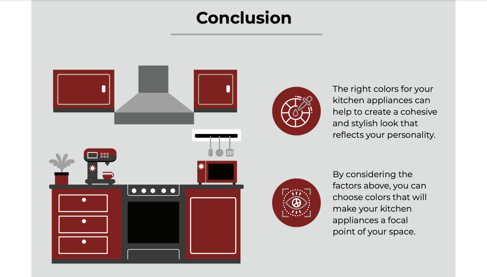
Identifying a range of complementary colors can also provide you with a lot more freedom when decorating your kitchen, alongside creating a space that looks a lot more visually appealing. After all, it enables you to create a space that is dynamic, with varying colors, as opposed to everything appearing uniform or clinical. By extension, this can be a great way to show off your personality!
- Interior Color and Psychological Functioning (Frontiers in Psychology)
- Wolf: Wolf offers their ranges in 14 classic and contemporary finishes, including Stainless Steel (RAL 9003), Black (RAL 9005), and Red (RAL 3028).
- Viking: Viking ranges are available in a wide range of colors, including Apple Red (RAL 3003), Cobalt Blue (RAL 5013), and Forest Green (RAL 6012).
- Thermador: Thermador offers their ranges in 12 different colors, including Star Sapphire (PMS 286), Titanium Gray (PMS Cool Gray 7), and Lava Rock (RAL 8028).
- Bertazzoni: Bertazzoni ranges come in several colors, such as White (RAL 9010), Yellow (RAL 1004), and Dark Blue (RAL 5004).
- GE: GE ranges are available in Stainless Steel (RAL 9003), Black Slate (PMS Cool Gray 11), and White (RAL 9016).
- JennAir: JennAir ranges offer several custom color options, such as Matte Black (RAL 9005), Oiled Bronze (RAL 1036), and Stainless Steel (RAL 9003).

